Showing posts with label Interior Design. Show all posts

Wednesday, 24 August 2011

Illustrated Book Of The Week : Shop America

shopamerica7


If you put all my favorite things into a pot, stirred them up and made them into a book. You might well get this.

shopamerica


Shops! America!! Mid Century Design!!! Who could ask for anything more?

shopamerica5


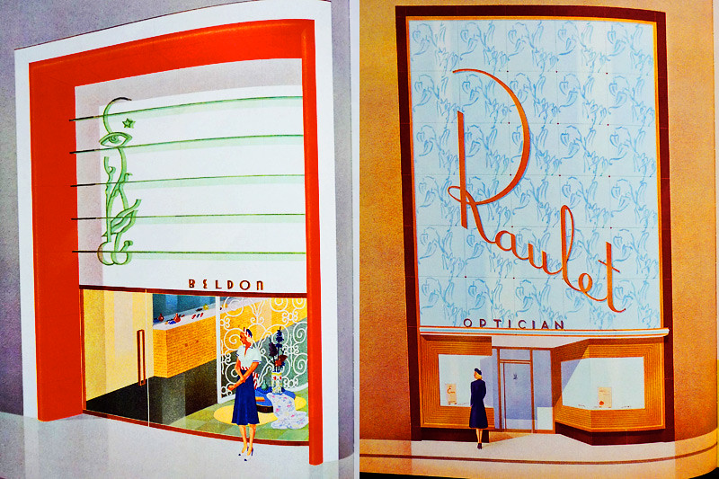
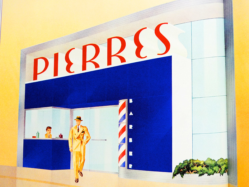
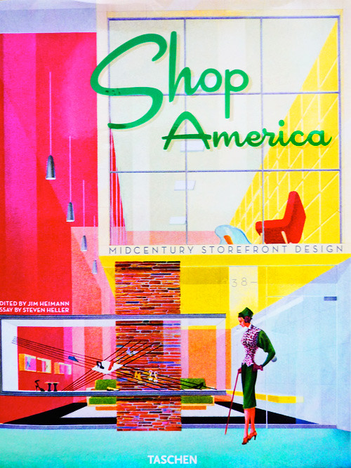
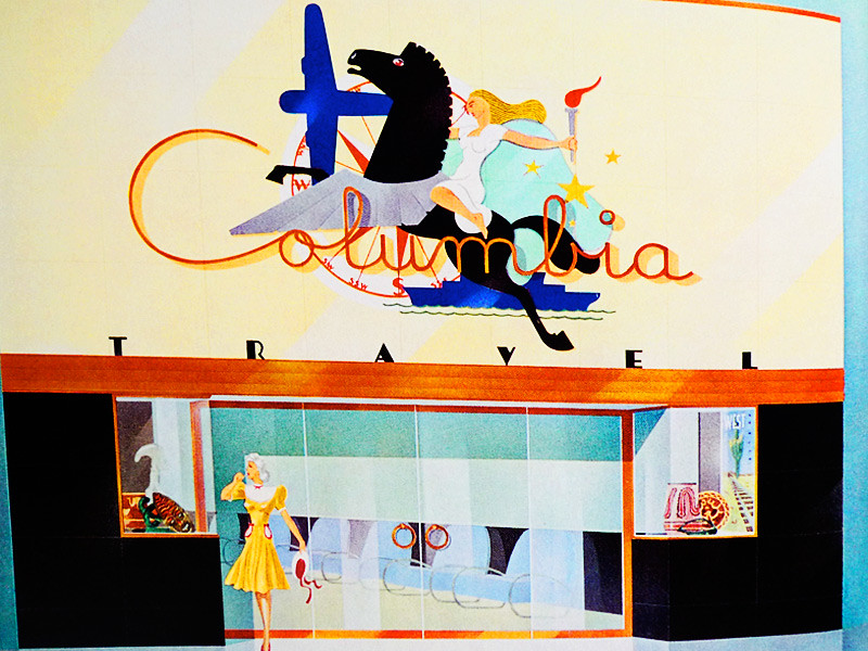
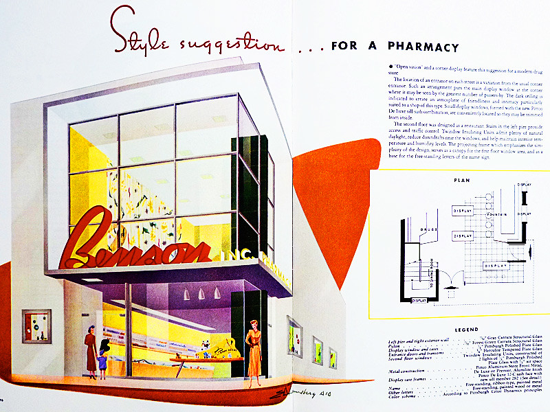
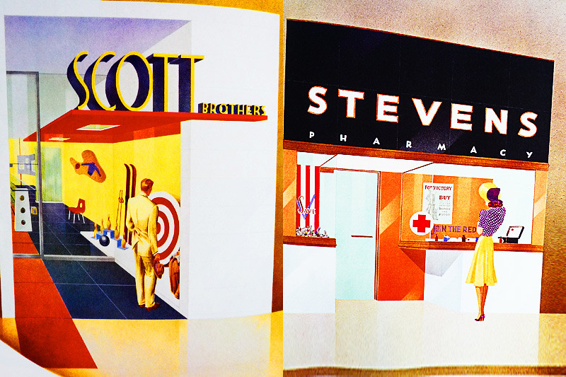
Shop America is a large format collection of 'style suggestions' for shop design from the Thirties and Forties. Idealised images of dream stores from one of the most romantic eras of design in the Twentieth Century.

shopamerica1


Everything from sporting good shops and pharmacies

shopamerica3


to cosmetic stores and opticians


shopamerica4


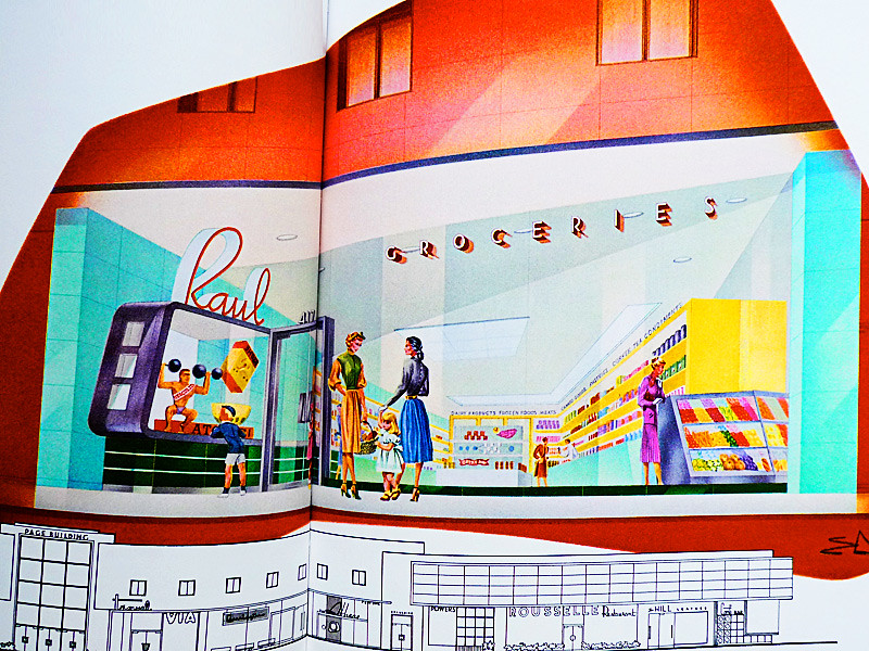
The use of colour is particularly inspiring - just look at the tones suggested for a supermarket (Much as I love Waitrose, this is far more alluring, isn't it?)

shopamerica2


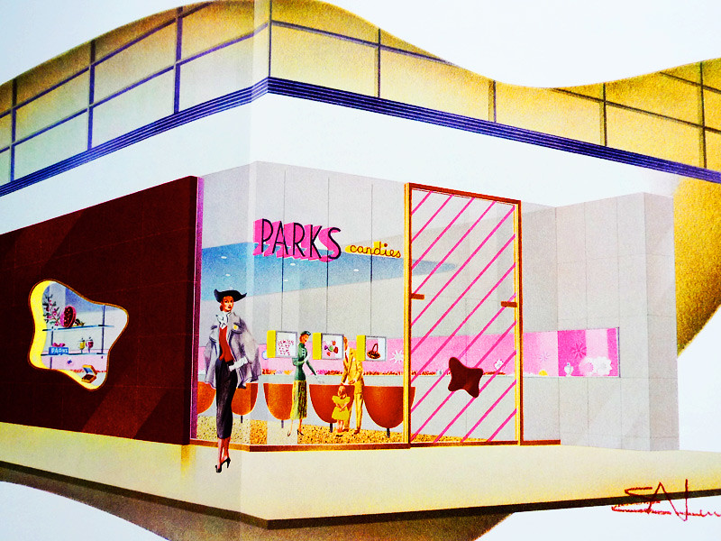
And the illustrations are incredibly stylish - even the sweetshops have a hint of 30's pulp fiction..

shopamerica8


Others are straight out of classic film noir. I could swear that this woman is about to pull a revolver out of her purse and shoot the other chick dead. I've watched enough Joan Crawford films to know, eyebrows like that can only mean one thing...
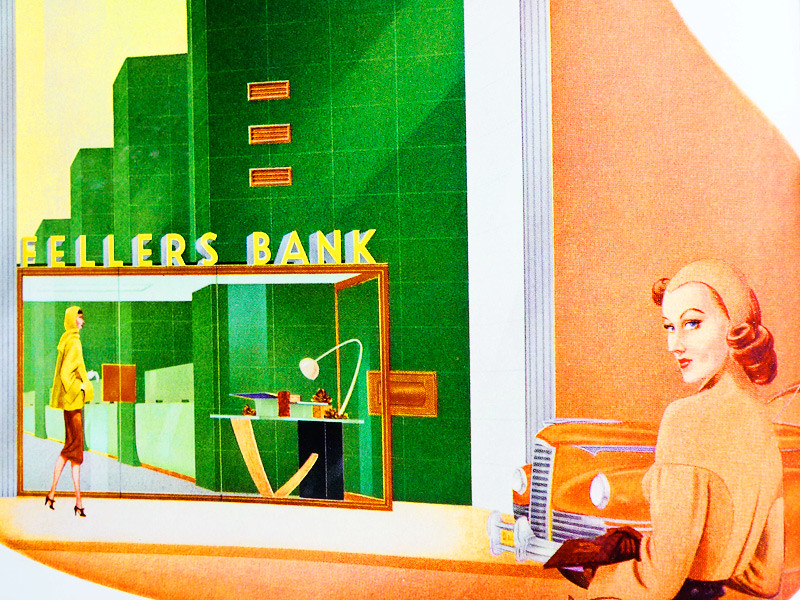

shopamerica6


...Trouble.


Shop America: Mid-Century Storefront Design, 1938-1950 Edited by Jim Heimann, with an essay by Steven Heller is available from Taschen Books

Wednesday, 17 August 2011

Stijl-ish

It's amazing how really inspiring exhibitions just keep on, well, inspiring.

It's been nearly eighteen months since I saw the van Doesburg exhibition at the Tate Modern (I've already written about it here) - but I'm still feeling the after effects today. A couple of new acquisitions have brought it back to mind.

Like this.

campblanket2

Which really makes me think about some of the less well known artists that were shown. I'd never heard of Ilya Bolotowsky before, but his use of colour is very exciting. Paintings like this one take the classic forms of 'De Stijl', but elevate them with a very sensual ,stimulating palette

Bolotowsky

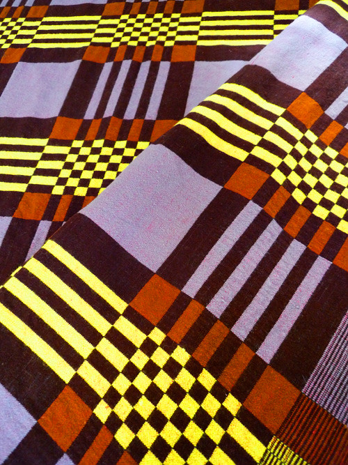
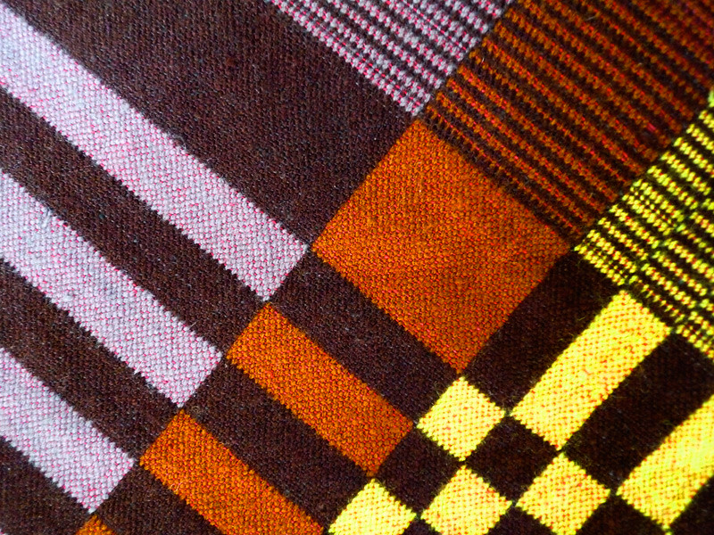
This blanket has an equally compelling colour range. Lilac, yellow and two tones of brown? Very unusual. The man I bought it from claimed it was Scandinavian, but I think it's probably a classic American camp blanket. Wherever it's from, it's a beauty.
campblanket1

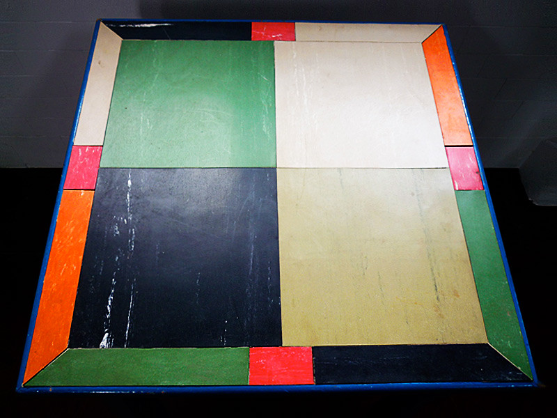
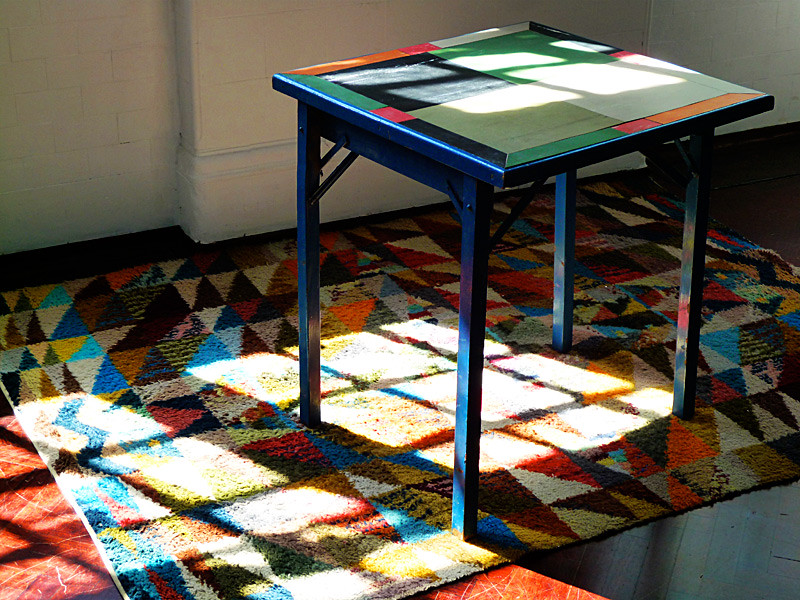
Then there's this little darling.

linotable4

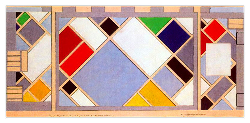
Which totally reminds me of some of van Doesburgs archectural projects, like his design for the cinema and dance hall at, L'Aubette in Strasbourg.

1926-28_strasbourg_doesburg

doesburg

linotable3

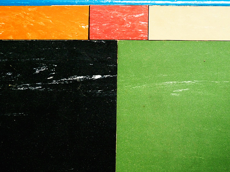
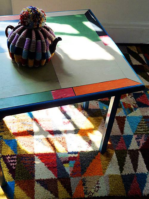
It's actually a card table that has had lino inset into it. I've never been much of a fan of lino - as it has too many bad connotations of damp loos and shabby kitchens circa 1974 - but I may have to rethink that. The work on this table makes me want to start creating 30's inspiring patchwork lino floors in my bathroom, cubist lino-covered furniture, linoleum light fittings...

linotable2

Stop! I'm getting carried away. I need to calm down and have a cup of tea.

linotable1

I'm not sure that van Doesburg would approve of that pompom though...

Tuesday, 9 November 2010

Objets n' Art - Chez Sorrell

sorrell1

Have you ever wondered what would happen if an antiques dealer with artistic leanings married an artist with a penchant for collecting? And they moved to the seaside?

sorrell6

Well, gentle reader, wonder no more.

sorrell5

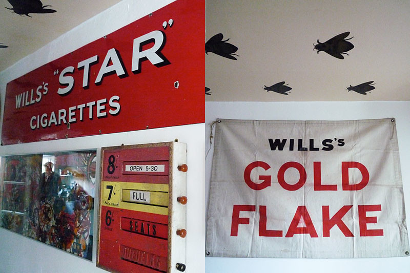
Regular visitors of this blog will be familiar with the names of Steve and Edele Sorrell as being one of our favorite vendors at Spitalfields Market. Their stall is always guaranteed to be filled with delightful objects, always displayed in a most creative fashion, just waiting to be taken home for a modest fee.

sorrell4

Which is why I was very excited to receive an invitation to visit their home in the charming seaside town of Felpham. To say the least, I was not disappointed.

sorrell3

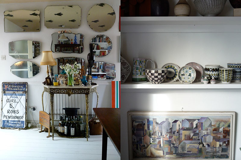
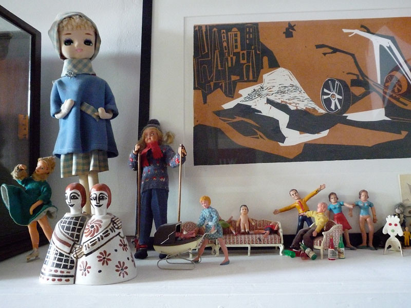
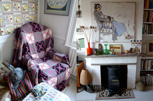
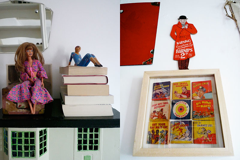
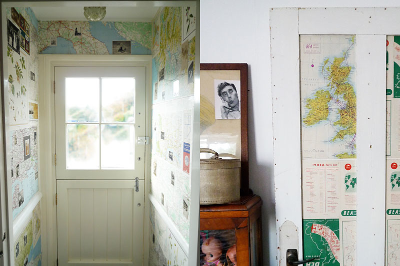
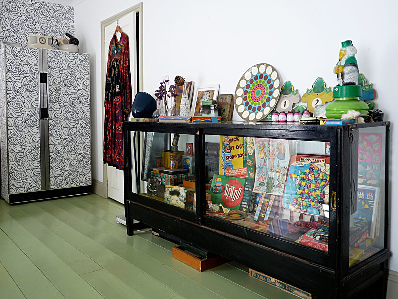
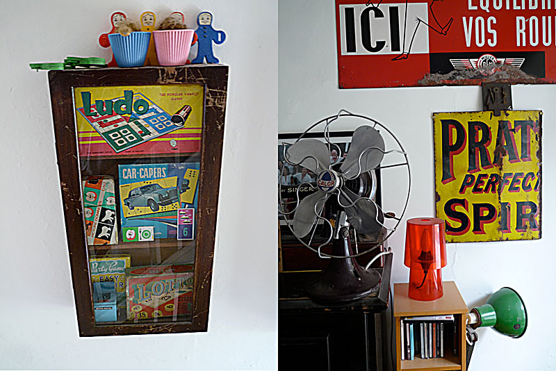
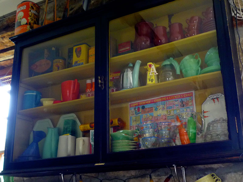
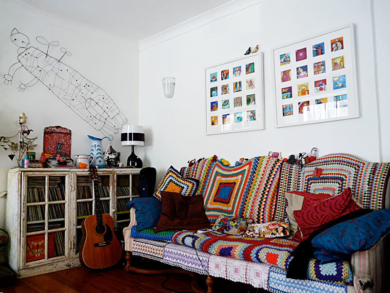
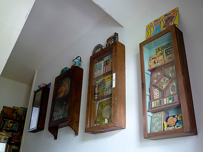
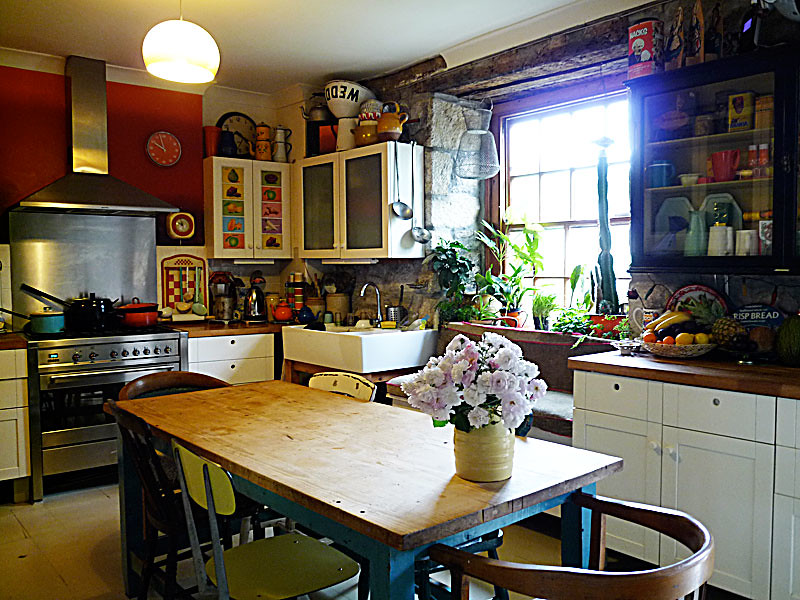
'Eclectic' is a horribly overused word nowadays, but there really is no other way to describe the Sorrell's taste. Minimalist art sits next to ornate Victoriana, strict Modernist forms live happily next to groovy sixties dolls.

sorrell2

It's a thoroughly personal mix - but one that never looks overwrought or affected.

sorrell9

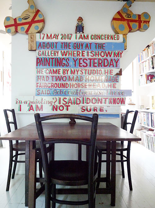
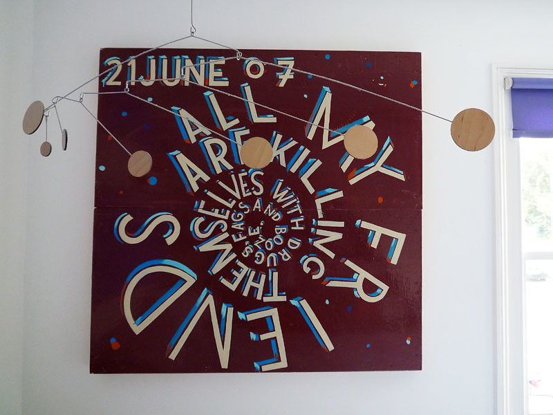
For me, the star attractions were the two art pieces by Bob and Roberta Smith - a perfect combination of all the things that the Sorrell's love. These pieces take found objects, hand made signs, and a quirky sense of humour and elevate them to a higher level.

sorrell8

With Edele's training as an artist and Steve's love of old things working together, this is as much an artistic installation as a home. It's like a gallery that you can live in - with the art and objects ever changing and evolving. A thoroughly stimulating and inspiring place to visit.

sorrell7

Friday, 16 July 2010

Chez Johnstone-Clarke - Creative Chaos in Cornwall

Minimalists look away now!

johnstone-clarke7

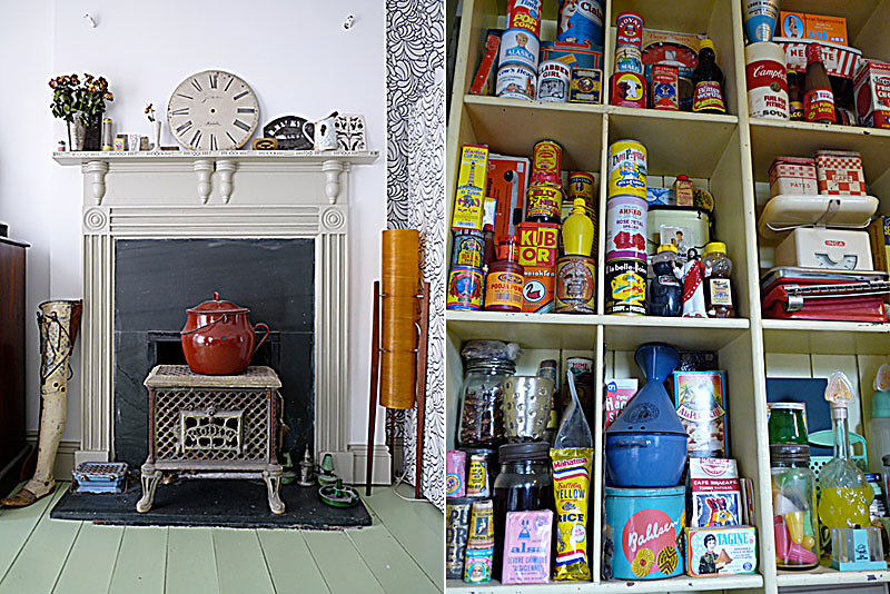
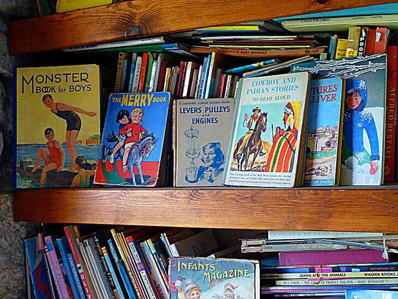
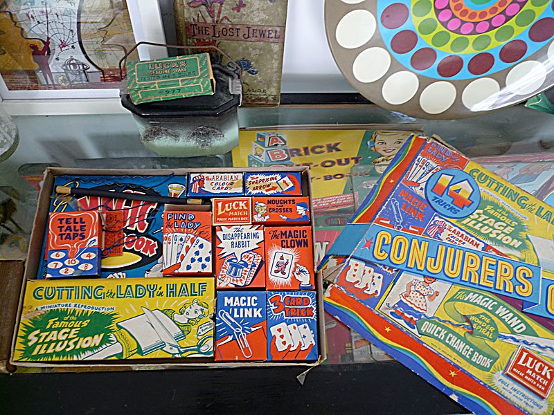
As you probably have gathered, we at The Curious Eye like strange and interesting objects. We enjoy scouring our local flea markets and car boot sales for quirky finds and once we have amassed such treasures, we like to display them in exciting and unusual ways. We like to think that we're pretty good at it, too.

johnstone-clarke9

However, next to Sue Clarke and Mat Johnstone, we are rank amateurs.

johnstone-clarke3

Mat designs gardens and Sue is a highly regarded illustrator, and although they work in different fields, they both share a similar approach. Both use multiple layers of colour and texture in highly complex ways. Modern and traditional elements are fused together and strange juxtapositions are created, with the best possible results.

johnstone-clarke6

Which is exactly the same approach they have taken to decorating their home in Cornwall.

johnstone-clarke5

What's amazing about this place is that although it is absolutely crammed with stuff, it never feels cluttered or messy. Everything works together to make a harmonious whole, and there's no feeling of sensory overload.

johnstone-clarke4

I'm sure they decorated it keeping Nietzche's philosophy in mind and remembering that 'Out of Chaos comes order'.

johnstone-clarke10

Or they just moved everything around until it looked good.

johnstone-clarke8

Whatever they did, the incredible eclectic mix works, and just goes to prove - sometimes, more IS more.

johnstone-clarke2

johnstone-clarke1

Magic!


Friday, 21 May 2010

Getting to the Point

And the collections begat collections...

needlepoint1

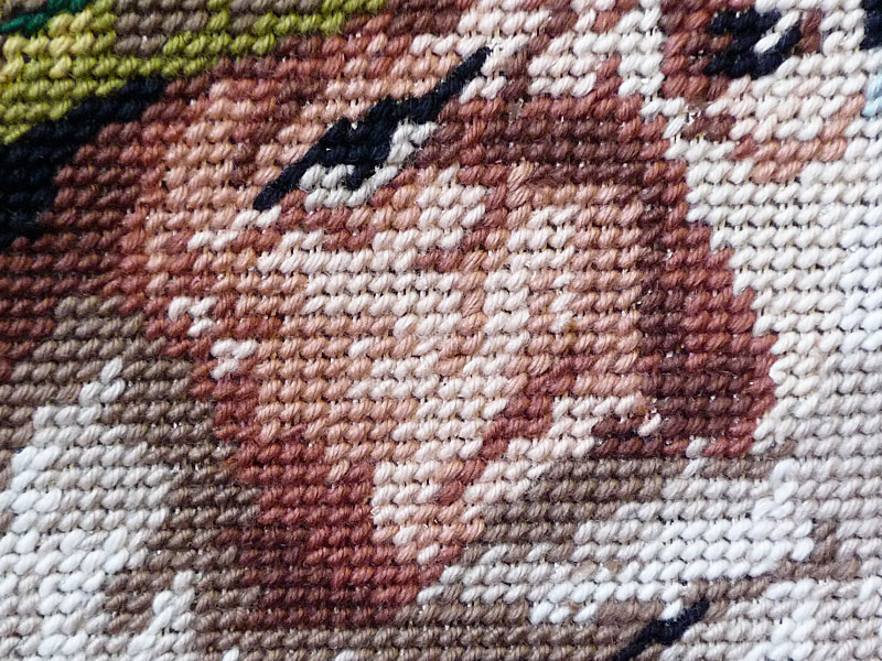
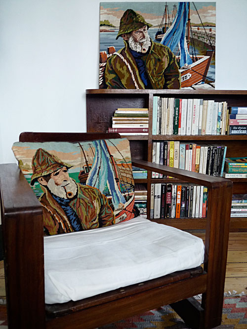
I was in Paris a few weeks ago, and came across this classic needlepoint picture of a salty sea tar. How do I know that it's a classic? Well, because about five years ago, I bought exactly the same image as a needlepoint cushion in a flea market in New York.

needlepoint2

This was a perfect addition to my bearded men collection (remember this?) - or so I thought.

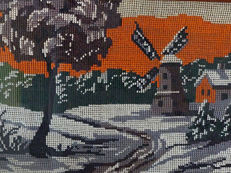
However, the longer I spent in Paris (and then later in Brussels) - the more I noticed exciting examples of needlepoint, and came to realize how fantastic and underutilised they are. The use of colour and texture combined with the graphic quality can look very stylish, without any of the fusty echoes of 'handicrafts'. Best of all, they're so out of fashion, you can pick them up at flea markets for next to nothing.

needlepoint3

So - now there's a new collection in town - and I'm aiming to fill a full wall of the studio entrance with needlepoint.

needlepoint4

Wish me luck!


Friday, 23 April 2010

Removed

removed1

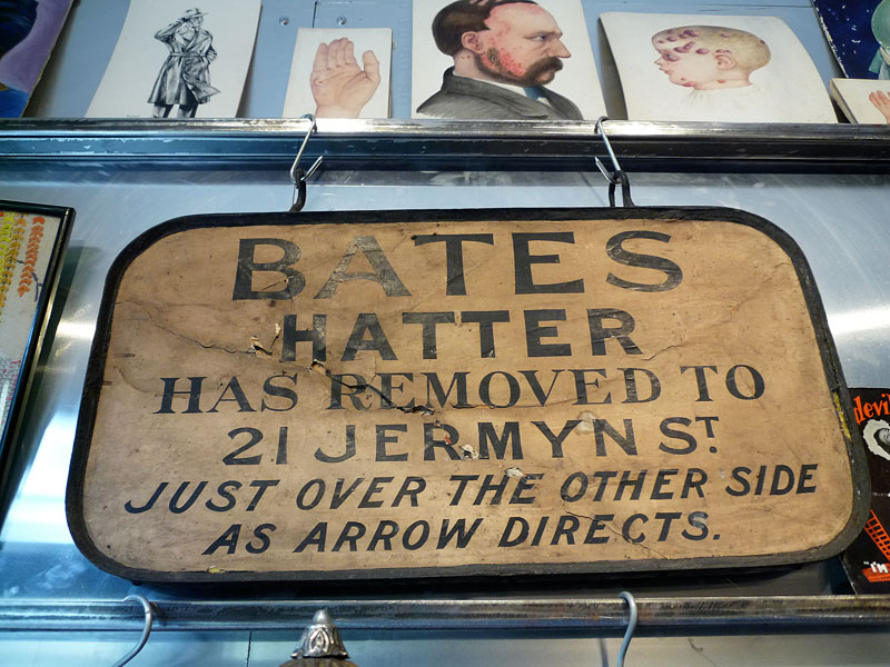
There was quite a bit of consternation earlier this year when Bates the Hatter closed their doors. One of the classic Jermyn Street gentleman's establishments, Bates was
a shop that seemed completely displaced in time. Throughout the narrow interior, dark wood shelves were crammed with every sort of old school chapeau, from Panama to Homberg via Boater and Fedora. This was the sort of perfect Victorian interior only ever seen in Dickensian adaptations and slavishly retro bars in Brooklyn.


removed2

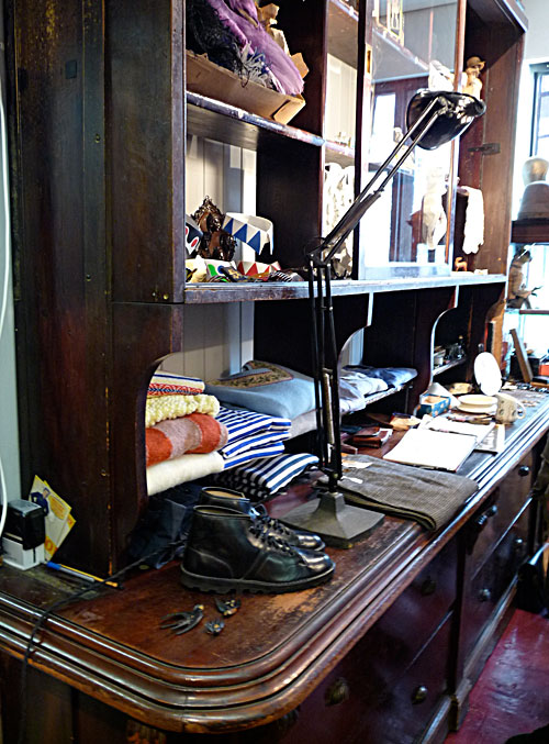
Sadly, it's another victim of 'regeneration' (ugh). The shop has been shuttered, and the business has moved into a shared premises with Hilditch and Key. But fear not, decor fans! I'm glad to report that most of the shop fittings have found a very good home.

removed3

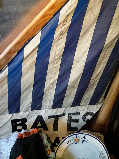
They've been salvaged and re-used by our old friend Nathaniel at M.Goldstein, who is happily displaying his wares from them in his shop in Hackney Road. As far as hauls go, this must be one of the all time greats. Not only was Bates legendary, but the fittings sit so perfectly in the space that they almost look made to measure. A few of the salvaged pieces are for sale, and I'm desperately racking my brains for an excuse to buy the awning for the studio - if only I could think of a canny way to re-purpose it for interior use.

removed4

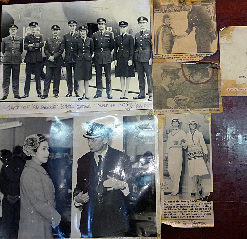
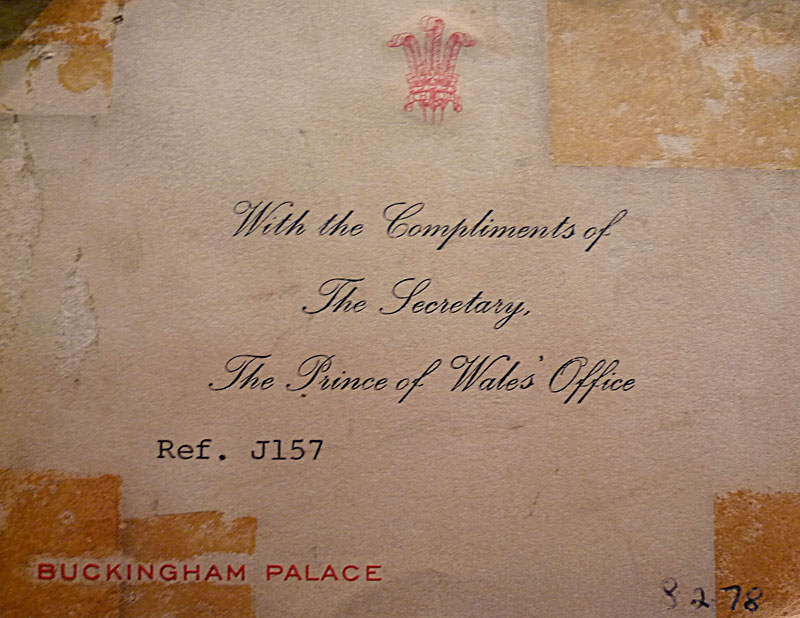
As if the furniture wasn't amazing enough, some of the shelves' interiors have great bits of ephemera attached, adding extra flavour.

removed5

Always nice to have royal approval...

Wednesday, 21 April 2010

Juxtapositionings

I just thought I'd throw in a few detail shots of the set ups in the studio at the moment. Unpacking all my stuff and rearranging it has thrown up some interesting juxtapositions.

Studiodetails4

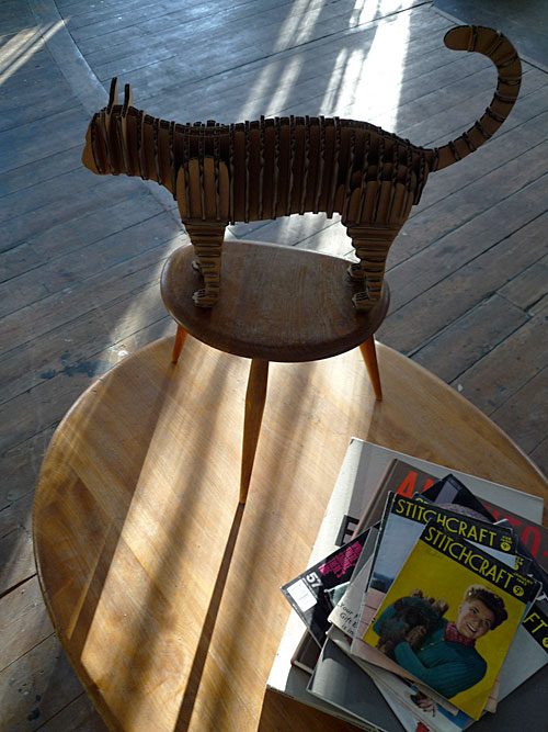
So, we have a D-Torso cardboard cat (a gift from my mother - thanks Ma!), on two stacked Ercol coffee tables, next to some vintage knitting magazines found at Norman's stall in Dalston.

studiodetails1

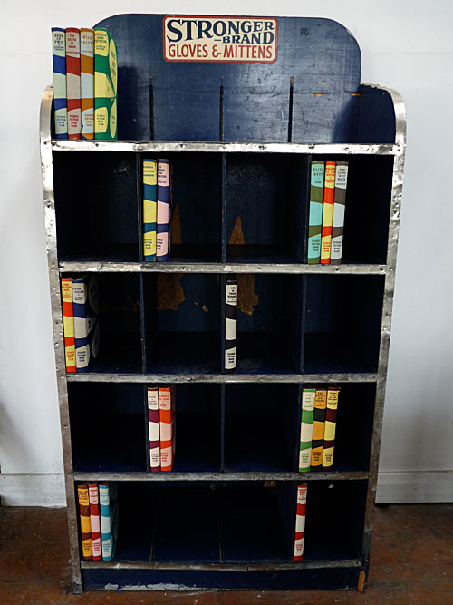
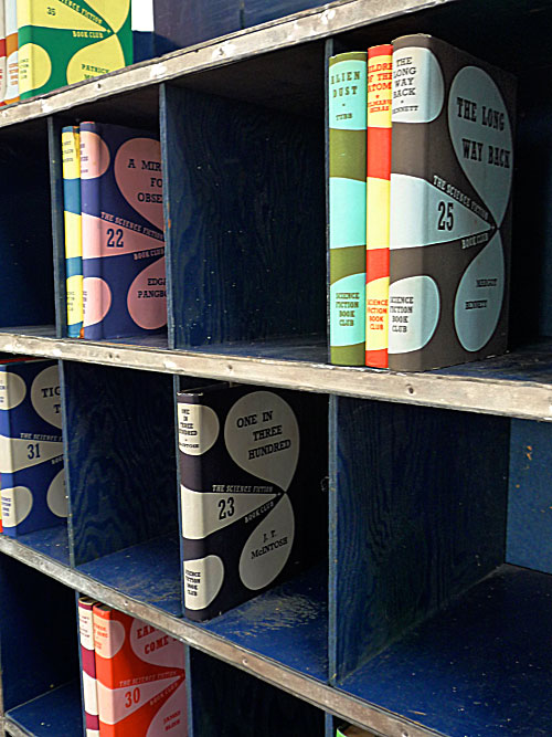
A set of 1950's sci-fi classics found on the Suffolk Coast slotted into a 1930's American shop fitting brought over from Chicago.

studiodetails2

I particularly like the interesting colour mixes of these - army green and turquoise, violet blue and baby pink - very inspiring!

studiodetails3

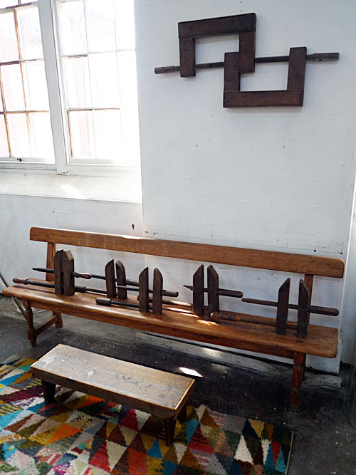
And finally, a fast growing collection of wooden clamps, a Sussex church pew, a miniature wooden bench and an Art Deco Rug.

Putting it together is like having a giant junk jigsaw which needs a bit of thought before it all fits together nicely. It's a game of mix and match that is going to keep me amused for many years to come.