I've always liked De Stijl, but it was probably the amazing van Doesberg show at the Tate Modern that pushed me over the edge into loving it. Eleven rooms of modernist graphic masterpieces will do that to a person.
I think it's the highly refined simplicity of the work that appeals. An elevated take on the functional, pared-down industrial style that I like so much.
Which is why, more than ever I'm becoming interested in objects and furniture that combine simplicity, graphic elements and elegance.
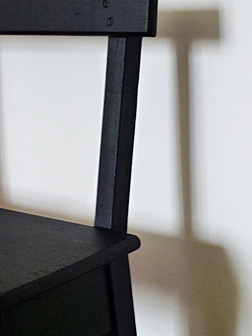
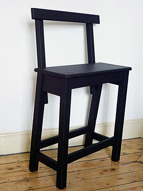
Take this stool for example. Probably my favorite buy of the last six months, it originally came from an old mill (via Jamie at Fish Island Antiques). The proportions and the construction are as simple as you get, but it works completely harmoniously. It's the sort of object that an industrial designer could spend months trying to get completely right, so the fact that it was probably just knocked up in a few hours by a local joiner only adds to its beauty.
(in case you're wondering - it was originally lacquered brown, but I've given it a few licks of blackboard paint to emphasise its fantastic graphic quality)
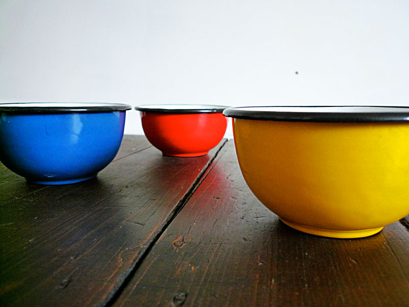
My other Stijl-ish buy of recent weeks are these enamel bowls from Merci in Paris.
I've been buying enamel for over a decade now - mostly old pieces that end up being well used in the kitchen. Modern enamel rarely does it for me, it's usually too badly made or it looks like a pastiche of the original vintage style. But these bowls really give me a thrill. Everything about them is right - the depth of colour, the shape and size, the quality of the materials. They're just about perfect.
I'm sure Theo and Piet would approve.
Van Doesberg and The International Avant Garde show is at Tate Modern for two more weeks (ends May 16th).
Highly, highly recommended!


No comments:
Post a Comment