Showing posts with label Graphic Design. Show all posts

Wednesday, 14 December 2011

Methods of Dance (a small collection of 80's electro vinyl)

v15

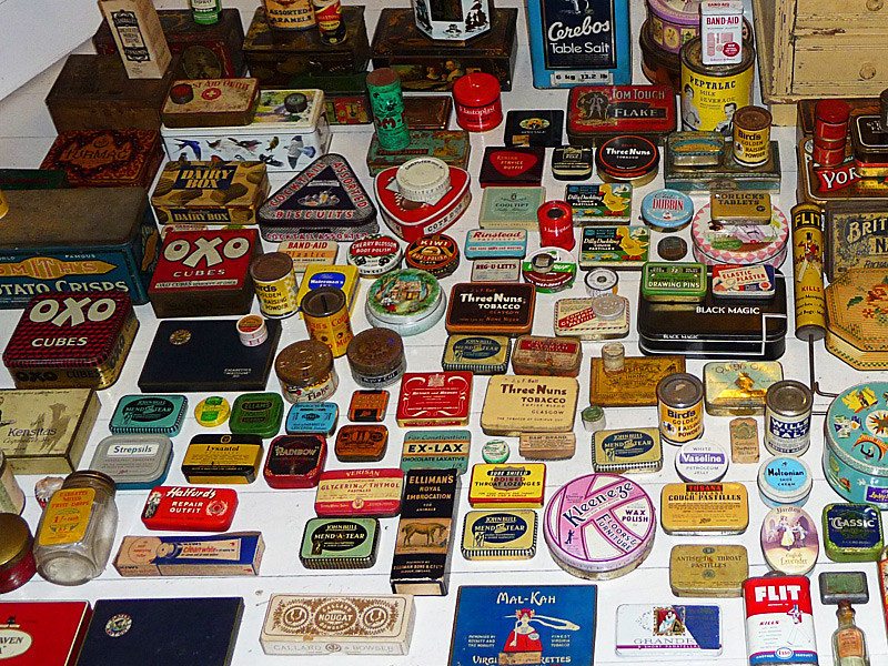
I was having a bit of a clear out a few days ago when I came across a large hefty envelope, further investigation revealed a collection of early 80's electro albums and 12 inches. 
Yes this seems to be all that remains of my vast collection, the rest of which has just disappeared. The selection is pretty eclectic and obscure but would almost certainly be considered gold dust to any number of my Dalston hipster neighbours.
I thought I would share the art work . If you want to check out any of the tracks most of them can be dug up on youtube. The album above is a compilation including the likes of B.E.F, Devo, Heaven 17, Japan and Magazine. The back cover features a long and wordy sleeve note from Paul Morley.

v14

Technodelic the 1981 album by Japanese hipsters Yellow Magic Orchestra.

v13

'Looking for St Tropez' by the obscure belgian trio Telex.

v9

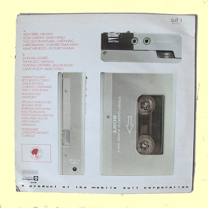
This is so obscure I can't even remember anything about it . I think I probably only bought it for the cover, which used the incredibly desirable and oh so unobtainable for me at the time, Sony Walkman. (back cover below)

v10

v6

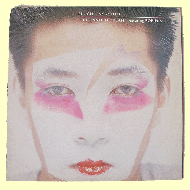
Riuichi Sakamoto previously member of YMO , then became famous for the music of the David Bowie film 'Merry Christmas Mr Lawrence'

v12

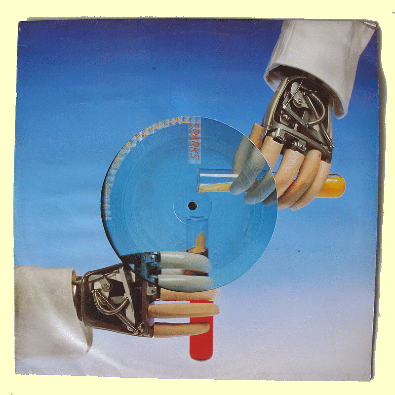
Sparks a 12 inch from their fabulous 1979 'album no.1 in Heaven'
this is actually made from yelow vinyl (see below)

v11

v3

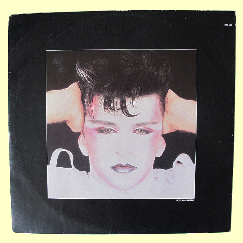
and now for the rather large collection of Visage ephemera, here their 2nd album cover photographed by Helmut Newton dressed by Anthony Price and 'presentation' by Peter Saville. (below inside cover)

v4

v2

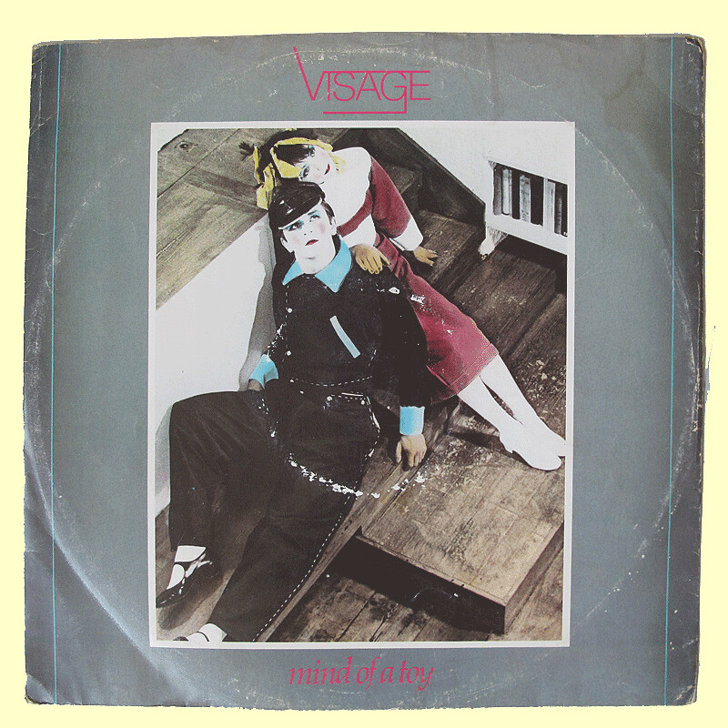
12 inch 'Mind of a Toy' (back cover below)

v1

v5

12 inch 'The Damned don't Cry' again Hemut Newton photography and Peter Saville design.

Wednesday, 24 August 2011

Illustrated Book Of The Week : Shop America

shopamerica7


If you put all my favorite things into a pot, stirred them up and made them into a book. You might well get this.


shopamerica


Shops! America!! Mid Century Design!!! Who could ask for anything more?


shopamerica5


Shop America is a large format collection of 'style suggestions' for shop design from the Thirties and Forties. Idealised images of dream stores from one of the most romantic eras of design in the Twentieth Century.


shopamerica1


Everything from sporting good shops and pharmacies


shopamerica3


to cosmetic stores and opticians


shopamerica4


The use of colour is particularly inspiring - just look at the tones suggested for a supermarket (Much as I love Waitrose, this is far more alluring, isn't it?)


shopamerica2


And the illustrations are incredibly stylish - even the sweetshops have a hint of 30's pulp fiction..


shopamerica8


Others are straight out of classic film noir. I could swear that this woman is about to pull a revolver out of her purse and shoot the other chick dead. I've watched enough Joan Crawford films to know, eyebrows like that can only mean one thing...


shopamerica6


...Trouble.


Shop America: Mid-Century Storefront Design, 1938-1950 Edited by Jim Heimann, with an essay by Steven Heller is available from Taschen Books

Wednesday, 10 August 2011

A Malarky on Redchurch Street

malarky1

A Sunday stroll in the east end now obliges a swagger down Redchurch Street, especially when, as was the case a few weeks ago this provides an opportunity to dip into the last days of the sales. Although there was not much remaining a few super-discounted items were purchased, but far more exciting was the discovery of this sumptuous piece of wall are signed Malarky .

malarky2

malarky3

malarky4

malarky5

malarky6

malarky7

malarky8

malarky9

malarky10

Malarks' blog

Monday, 10 January 2011

Flag It !

flaguk

I bought this collection of cardboard flags at the 'grande bradderie de Lille' in September. I was seduced by their curious pop art aesthetic, they are mini pop tableaux in the tradition of warhols' tins of soup and brillo pad boxes. As a little new years quiz see if you can name all 11 counties, to help you out the are all European or close neighbors (answers at the bottom of this post.


flagfrance

flagturkey

flagbelgium

flagholland

flagitaly

flagsweeden

flagaustria

flaggreece

flagirish

flagdanish

countries from top to bottom, UK, France, Turkey, Germany, The Netherlands, Italy, Sweden, Austria,Greece, Ireland, Denmark

Friday, 7 January 2011

Tons of Tins

tins

Our new roving reporter, Steve Sorrell, just sent us this delightful collection of receptacles. He tells us the story...

"It all started with a text message on a damp gloomy afternoon. A house clearance friend of ours was having a bit of a clear out and wondered if we would be interested in buying a few bits and pieces?

tins2

On past experience we knew that he'd have one or two interesting things so the following day we hot footed it over to his house. The first thing he produced was two rather large cardboard boxes of old tins; they looked promising, so we bought them without really bothering to inspect the contents. It wasn't until we arrived home and started to unpack them that we realised just how wonderful they all were.

tins4

Each one is a minor work of art. The type, the artwork and the colours are just beautiful. Who could resist the charms of Zig Zag polish or Boots chest and lung wafers? And as for Dilly Duckling cough pastilles, well...............


tins3

Steve and Edele's little collection of tin treasures will be available to purchase for your very own from this Thursday at Spitalfields Antique Market. Hurry! Before Dilly Duckling sells out!

Monday, 28 June 2010

Bloody Good

The sun is shining, the skies are blue, and it's time for the graduate degree shows - how inspiring!

newblood3

By far the best graduate show that I've seen this summer is D&AD's New Blood showcase - which highlights the most interesting new talents in advertising, design and illustration from around the country. It's always stimulating to see what the new generation is producing, and the direction that they are taking - and this year there was a particularly strong group of work that fused retro and modern styles to make work that was completely contemporary.

Take Matthew Bromley's work. Elements of skate-punk, graffiti and comic strip are mixed with a mid-century palette and graphic style to make something very fresh.

newblood4

Plus - he made life size masks. Always a winner.

newblood5

Then there's the more obviously retro-referenced work of Robert Fresson and Edward Tuckwell (both graduating from the exceptionally good Illustration BA at Falmouth).

Robert's work is beautifully intricate and very English. This image immediately makes me want to go on a picnic.

newblood2

On the other hand, Edward's pared down graphic style pays perfect homage to Film Noir.

newblood7

This book jacket of his is so beautiful I'd like it on my wall.


newblood8


Someone else obviously inspired by classic Americana is Aaron Alexander from Staffordshire University - this packaging for fireworks may well have been my favorite thing in the whole show. Far too nice to blow up.

newblood

Finally - huge compliments to Simon Cook (that's his stand at the beginning of this post). His website Stone and Spear is packed with fantastic things. Charming, naughty and with the most brilliant use of colour - his work gives me the thrill of the new that you always hope to get at graduate shows.

newblood6

With talent like this, blogs like grain edit are going to have the time of their lives. I can't wait to start seeing these guys work on billboards, books and products.